Visual hierarchy
Every screen makes a claim about what matters most. Visual hierarchy is how you make that claim deliberately instead of by accident.
The tools, in order of strength
Section titled “The tools, in order of strength”When two elements compete, the one that wins is usually decided in this order:
- Size — the bluntest instrument. Bigger reads first.
- Weight — bold text outranks regular at the same size.
- Colour and contrast — high contrast pulls the eye; low contrast recedes.
- Space — isolation creates importance. An element with room around it reads as separate and significant.
- Position — top-left first in left-to-right reading cultures, but this is weaker than people assume.
One primary action
Section titled “One primary action”A screen should have exactly one element that is clearly the most important. If you cannot point at it in half a second, neither can your user.
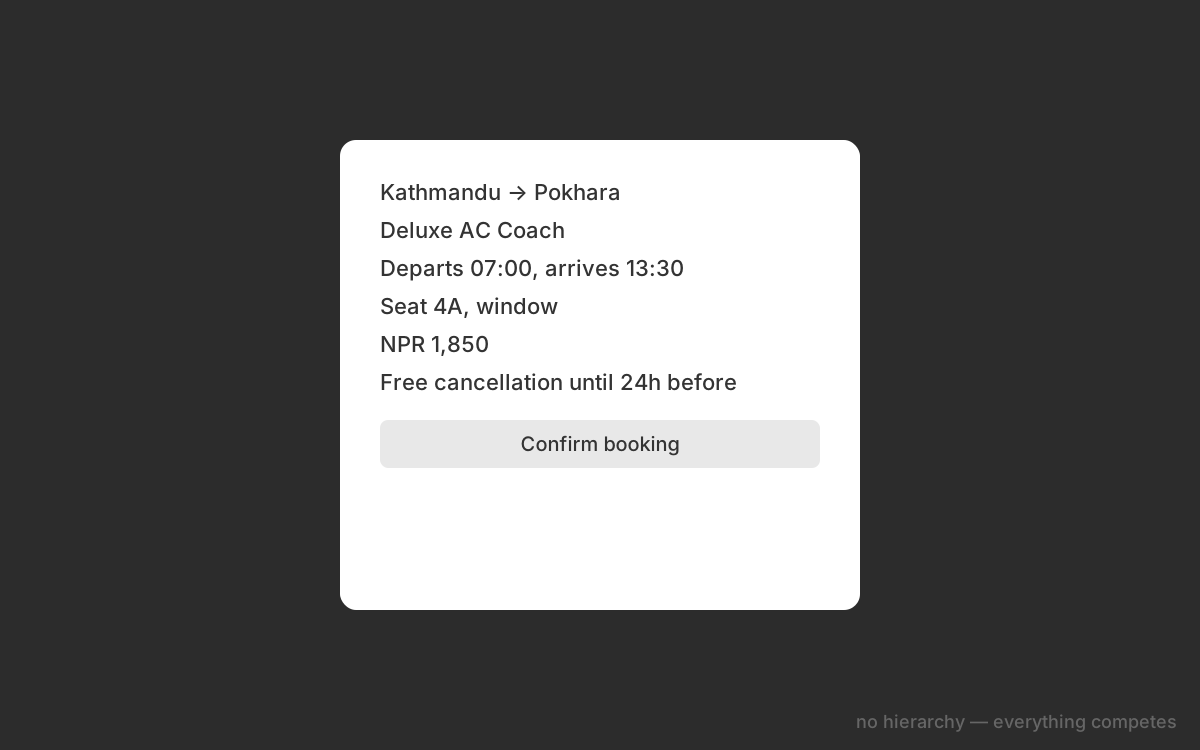 Flat — everything competesHierarchy applied
Drag to compare. Same content, same colours — only size, weight and spacing changed.
The squint test
Section titled “The squint test”Step back from your screen and squint until the text becomes unreadable shapes. What still stands out is your actual hierarchy. If the wrong thing survives — or if everything survives equally — you have work to do.
This is faster and more honest than asking a friend, because it removes your ability to read the content and be reassured by it.
Grouping
Section titled “Grouping”Related things should look related. Two labels that belong to the same field should be closer to each other than to anything else. This sounds trivial and is responsible for a large share of “this form feels confusing” reactions.
The rule of thumb: the space between groups must be visibly larger than the space within a group. If they are equal, the grouping does not exist.
Check your understanding
1A form has 16px between every element — between a label and its input, and between separate fields. What is the likely effect?
2You squint at your design and three elements remain equally prominent. What does this tell you?
3Which change would most reliably make a primary button stand out, assuming the layout is otherwise unchanged?